Choosing Complementary Colors: Best Door and Siding Pairs
The choice of color for the siding, doors and shutters on your home is obviously a very personal one. Still, it pays to take some consideration of the current trends and of what is most popular – especially if you're thinking of selling your home anytime in the next few years. With that thought in

The choice of color for the siding, doors and shutters on your home is obviously a very personal one. Still, it pays to take some consideration of the current trends and of what is most popular – especially if you’re thinking of selling your home anytime in the next few years. With that thought in mind, here are just a few of our favorite combinations with the siding color listed first and the complementary door color listed second.
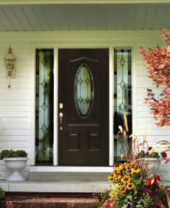
White and Black – A classic, conservative look that can be comfortably used on any style of home, from traditional Tudors through French country manors to ultramodern, contemporary ones. In addition to the door, also consider painting the shutters, the windows and possibly some of the gutters to accentuate the look.
White and Dark Green – If blending in more naturally with the environment around your home is more to your taste, then using a dark green instead of black as the complementary color could be just what you’re looking for. On a lot with multiple trees, the white of the siding will subside into the background while the dark green complements will be almost invisible until you’re standing right in front of the home.
 Beige and Natural Wood – Another outstanding choice for a natural look is a light, neutral tone paired with natural wood-colored doors and shutters. This choice is especially popular in the South, where the foliage never completely leaves the trees, shrubs and plants that surround a house. In addition, it’s a great look for deck, lake and beach houses, where a lot of glass is used to take the greatest advantage possible of the view.
Light Blue and Gray – A more muted look for structures located on the water involves using a light blue siding with a dark gray complementary color. The result is a home that blends in with the waterfront. Alternatively, you can opt for a gray-on-gray color scheme, but it’s recommended that the doors, shutters and windows be a distinctly darker tone for maximum effect.
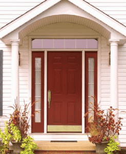 Almost Anything and Red – Nothing says “welcome” like a bright red door. The color is so versatile that the complementary color combinations are almost infinite. Stay simple with white siding, get a little more daring with a peach or light orange, or go completely off the grid with pink or lime green. We especially like red doors on traditional-looking homes, like Dutch colonials and gable-front houses.
Tri-Tone Pastels – If red isn’t exactly your cup of tea, consider using a pastel color with a darker complementary shade for your doors and windows, and a lighter shade for your gutters. This tri-tone effect is quite dramatic and will undoubtedly set your home apart from the others in your neighborhood.
Bright Hues – This is not recommended for the faint of heart – think the Artist Formerly Known as Prince – and you should check with your homeowner’s association before having your home painted, but brightly-colored homes are increasingly in fashion. It’s wise to do a test patch with your choice of colors before committing to the whole job to be sure you really like the effect.
For more information on the colors and styles available in vinyl siding and trim, as well other exterior design choices, visit us online at Paramount Builders.com, or reach our team directly at 888-340-9002.


